SPACES, INTERIORS & SPACIAL INSTALLATIONS
While in the early 90s, Hofmann Bonengél primarily focused on architectural projects, such as student residences, commercial buildings, hospitals, and private residences, his focus shifted quickly towards interiors. For more than three decades now, he has remained committed to product and interior design alongside his work as an artist, and to this day, as the founder and co-owner of Neon Berlin, he remains faithful to one of his mainstays: eyewear.
In this potpourri segment, Hofmann Bonengél showcases some of his past interior design projects and spatial installations, including immersive environments that blur the boundaries between functional space and spatial boundary experience. The projects reflect the artist's tendency towards a dramatic exaggeration of space, color theory, and questioning of perception, perspective, and materiality. Lighting and texture play a crucial role in creating immersive environments that stimulate the senses and provoke emotional responses from the viewers.
no slideshow
CLUE | OFFICE SPACES | 2016–2018
Located in Kreuzberg, the health app distributor Clue has recently moved into a new space spanning about 1500 sqm. The founder and managing director, who considers herself a pioneer of the women's empowerment movement, aims to create an open and diverse workspace that serves as a recruiting machine. To achieve this, the office space has been designed with colorful multi-purpose areas on two floors that cater to collaborative work in forum-like areas as well as smaller, more private retreat areas.
The open area in front of the logo wall mural made of acrylic glass and relief-like milled wooden panels doubles as an extension of the break area and a place for meetings or as a visitor zone. The design goes beyond the clichéd table football culture of start-ups and embodies the company's commitment to promoting diversity and empowerment.

CLUE | OFFICE SPACES | 2016–2018
The design transformes a former freight elevator into a recreational area that now boasts a view of a typical Kreuzberg rooftop landscape. The space features plants hanging from the ceiling, 50s garden chairs, and open planted lattice walls that create an airy conservatory atmosphere within the office landscape, complete with work desk groups.
The area is primarily reserved for casual, non-confidential meetings, and it exudes a clear, glare-free, and enchanted light courtesy of the specially designed icosahedron crystal luminaires.

The main partition wall on both sides features two historic apothecary cabinets that were contributed by one of the investors, which have been recessed into the wall in their original form. An employee gallery is displayed in the interior showcases, where each employee is scanned and included as a 3D figurine in the company's Olympus, even after they leave the company.
CLUE | OFFICE SPACES | 2016–2018
The reception area of a company has been designed to be an open and welcoming space that also serves as a break area and for onboarding. The client desired a chalet-style design, which was achieved by using real wood that was aged in the Swiss mountains to create a lying U-shape.

MONOPOL HOUSE | PRIVATE RESIDENCY IN BERLIN | 2019
This is the Complete renovation of a historic building located in the so-called Monopoly settlement in Berlin, which, as an ensemble, is under preservation order, in Berlin. Although the interior of the house is not under preservation order, it was the wish of the client and architect to make all new fittings, if not historical, at least in the style of the original building.
The handmade hexagonal tiles were specially manufactured in a traditional family business in northern Catalonia and were carefully matched in detail at the corners.


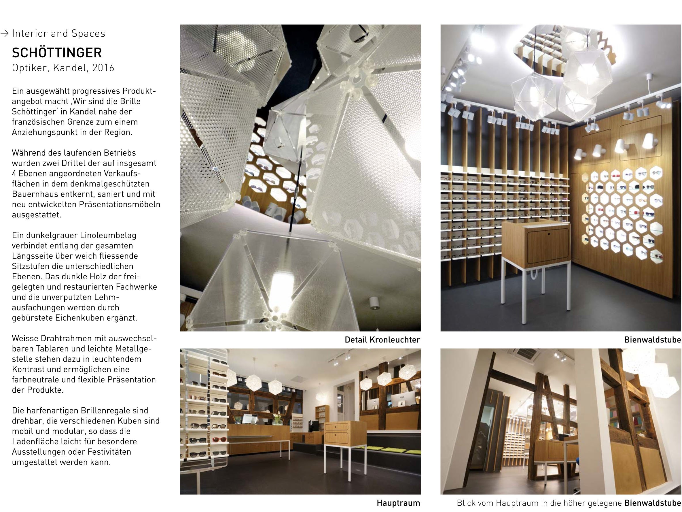
SCHÖTTINGER | OPTICAL STORE | 2016
The Kandel-based eyewear retailer Wir sind die Brille Schöttinger offers a progressive product range and has become a regional attraction. The store's listed farmhouse underwent a renovation where two-thirds of the sales areas on four levels were gutted and equipped with newly developed presentation furniture. The levels are connected by a dark grey linoleum flooring with softly flowing seating steps, complemented by exposed and restored trusses with unplastered clay infills and brushed oak cubes.
White wire frames and light metal frames with interchangeable shelves contrast with the dark wood and provide a flexible and color-neutral product display. The harp-like shelves for glasses can be rotated, and the modular cubes are mobile, allowing for easy reconfiguration of the store space for special events.
LUPENPRINZ UND ADLERAUGE | CHILDREN'S OPTICAL STORE KOBLENZ | 2015
This is an offshoot business of the Koblenz optician Coblens. The target audience is children to adolescents, but the business actually aims at the parents of the children who are already adult customers. The original color of the original optician is complemented here with a day-glow orange.
The casual grouping of the seating stools also serves as a storage station for children's toys. Outside, a fluorescent signage attracts attention to the store from afar, and the stylized glasses in the logo are reminiscent of the Harry Potter glasses, quite intentionally of course.

COBLENS | OPTICAL STORE BERLIN | 2014
The second showroom of the luxury eyewear brand Coblens is situated in the bustling tourist hub of Berlin Mitte, near the iconic Hackesche Höfe. Featuring perimeter benches that double as storage for the store's inventory, the elongated central counter serves as a workspace for straightening glasses, as well as a consultation and checkout area.
The sunglasses display is located near the entrance and adjacent to the staff workspace, providing easy access for customers. To accommodate the in-depth consultations necessary for corrective eyewear, a separate area is furnished with carefully selected midcentury furniture.

COBLENS | TRADE FAIR STAND | 2013
The Coblens eyewear exhibition showcased a waiting hall from the late 50s, complete with four consultation stations, a custom-built modular exhibition system, counters in the appropriate period look, and Midcentury antiques. The use of digital prints of rose palisander on the stand construction walls created an authentic impression, with each panel photographed from individual antique veneer sheets in high resolution and elaborately post-processed.
The surface was modelled on the boat varnish finish common in the 50s. The installation is an example of Hofmann Bonengél's expertise in interior design, spatial installations, materiality, texture, and immersive environments.

COBLENS | OPTICAL STORE | 2013
This store, renovated to match its original 1950s style, has an open and brightly lit entrance thanks to the anodized post-war aluminum window system protruding from the facade. Instead of a superficial presentation of goods, the store features constantly changing exhibitions curated alongside thematically arranged product worlds and selected everyday products.
A generous leather seating area directly behind the walk-in display window invites customers to in-depth discussions, and the store concept prioritizes specific and personal advice with a minimal selection of products.

WHITEOUT & GLARE | SHOWROOM | 2011
The Whiteout & Glare showroom in Berlin boasts an edgy and industrial aesthetic, featuring polished asphalt flooring and raw, textured concrete walls typical of GDR-era prefabricated constructions. The dynamic backdrop sets the stage for monthly installations that showcase the innovative eyewear brand's latest designs. The building's services are exposed and integrated into the design, with black steel tubes forming branching tracks that lead to junction boxes, switches, and adjustable lighting fixtures. A nearly 4-meter long aquarium acts as a transparent room divider, offering a glimpse into the office area while also providing a shield for staff to discreetly observe the exhibition space. This outstanding project earned the Red Dot Design Award in 2010 and was a nominee for the Design Award Germany in 2011.


WHITEOUT & GLARE | TRADE FAIR STAND | 2009
This exhibit was specifically built for the SILMO optical fair in Paris and constructed entirely from recycled cardboard and textile adhesive tape. In just one day, using a single folded module, the 12-meter long stand was erected. The load-bearing walls are made up of a recurring hexagonal element, consisting of six cardboard triangles each. An off-center raised center causes the uniform hexagons to appear highly distorted, while 12 different shapes can be assembled using just one element, resulting in a strongly fissured and randomly crystalline-looking outer skin. The project was awarded the red dot design award 2010, the iF communication design award 2009 in two categories, and the Green Good Design Award 2010 of the Chicago Athenaeum, and received nominations in two categories for the Designpreis Deutschland 2011.


WHITEOUT & GLARE | REEF CAMPAIGN SHOWROOM | 2008
A campaign was launched using a unique collection of sunglasses to raise awareness about the declining state of coral reefs worldwide. The sunglasses were named after endangered reef dwellers and accompanied by descriptions of the animals and their habitats. The goal was to draw attention to the issue and encourage people to take action to protect these important ecosystems.


PORTFOLIO_SPACES_WHITEOUT-GLARE_2008
FOUND | SHOWROOM | 2007
The store 'Found' takes its inspiration from Dadaism's 'Objets Trouvés', or found objects, everyday objects given new meaning, but here in a more everyday, usable context.
The store owner sources products from arts and crafts fairs and traditional craft businesses, and displays them in a sparsely designed, flexible space.
The project was awarded the red dot design award 2010 and nominated for the Designpreis Deutschland 2011.


BLANK | TRADE FAIRE STAND | 2007
Blank, in this context, refers to both a term meaning shimmering and bright, as well as a concept representing an empty space that can be filled with content. The homeware label Blank embodies both meanings, with high-quality textile goods, woven fabrics, and home ware products made of natural materials such as glass, ceramics, and leather.
The range is divided into three product families: Karma for understated elegance, Kauri for a natural and rustic lifestyle, and Kinetik for a sporty and forward-looking orientation. The booth and showroom showcased each family with a different light temperature: Kinetik with cold light, Karma with neutral white, and Kauri with warm white.
This project won the red dot design award 2010 and was nominated for the Designpreis Deutschland 2011.

TRESSETTE | RESTAURANT BERLIN | 2005
The Tressette project is a restaurant design inspired by the traditional card game from Italy. The back of the playing cards, often designed with small-scale check patterns, served as inspiration for the design of the textile surfaces in the restaurant and the glass mosaic ceiling with the differently colored reveals of the ceiling beams. The castellated ceiling appears to be colored differently from every angle of the room, corresponding to the different suits of the deck of cards. The project also features a long and narrow bar table with hydraulic legs that can be lowered in the evening and a table surface that can be folded out to double as a restaurant with a generous table. The project won the iF communication design award in 2005. (In collaboration with unit-berlin)


PREMIUM FASHION FAIR | PREMIUM BAR | 2003
This project involved setting up a temporary bar in the subway shafts of the U55 Chancellor subway during the high-end fashion fair 'Premium' in Berlin in 2003. The goal was to create an inviting and atmospheric meeting place for exhibitors and buyers.
The subway halls were formwork-rough and empty, and the bar was set up with simple means. The project aimed to provide a widely visible contact point and a space for discussion and rest.

VOLKSWAGEN | PHAETON ROLLOUT SEEMORE NATIONALGALLERIE BERLIN | 2002
The new National Gallery in Berlin was the venue for the world's first presentation of the Volkswagen Phaeton. In the completely cleared hall, a single phaeton faced a phalanx of over a dozen Seemores, which served a similar function to sighting telescopes.
Using highly sensitive sensor technology, every point on the vehicle could be visually controlled and details were displayed on the built-in screen when a 'hotspot' was reached. This project utilised an early version of augmented reality.

NUBIAZ | FASHION SHOWROOM | 2002
A fashion retailer expanded over two buildings on two sales levels in the middle of the Hackesche Höfe in Berlin. The turn-of-the-century building was gutted and extensively restored, and the newly planned outside staircase was designed to reflect the building's history while incorporating elements from the retailer Nubiaz's logo and corporate design.
The railings of the staircase feature a harp-like design reminiscent of the rounded "n" in the company label, and the presentation platforms and shelves also follow the corporate design.

CARATONGA II | FLOWER SHOP | 2002
Caratonga opened a new flower shop in the entrance area of a hotel chain near Friedrichstrasse, four years after the opening of their first flower shop in Berlin Mitte. The new shop retained the same concept and elements, such as counters, work benches, and plastic amphorae.
It also included museum-like showcases in large shop windows for the presentation of exotic and sensitive plants. The first Caratonga Flowershop from 1998 served as inspiration and continued as a shop in Berlin Mitte.

ZLU [ZENTRUM FÜR LOGISTIG UND UNTERNEHMENSPLANUNG] | OFFICE SPACE | 2001
The employees of the Center for Logistics and Corporate Planning ZLU refused the design of the office space initially envisioned by the parent company PIXELPARK for a new office floor in a high-rise building on Warschauer Strasse. Instead, they opted for standardized enclosed workspaces without glass doors or window areas facing the corridors. To still achieve a prestigious design, an interior, circumferential U-shaped corridor without natural lighting or exterior reference remained, with color strips of linoleum dividing the three corridors in a way that prevents easy estimation of the proportions or the size of the hallway. The project won the main prize 'Contractworld Award' at Domotex in Hanover in 2004.

![ZLU [ZENTRUM FÜR LOGISTIG UND UNTERNEHMENSPLANUNG] | OFFICE SPACE | 2001](https://images.squarespace-cdn.com/content/v1/63f9f6fad5ae374d807b918d/b4987deb-0833-4c71-b595-154fd4dbf927/PORTFOLIO_SPACES_ZLU_2001.jpg)
A foyer features highly transparent three-dimensional acrylic panels that glide back and forth over a length of more than 30m, symbolizing data packets being moved in the 'digital world.' The multi-story roof space includes a library floating above the company's graphics department, with conference rooms connected via fiber optic cables that change color to represent the passage of time.
PIXELPARK | OFFICE SPACES | 2000
Pixelpark AG opened its new headquarters in 2000 on the former site of the Berliner Glühlampenwerke. The more than 10,000 square meter space is divided by kinetic objects, light installations, and specialized areas, including protected areas of retreat, meeting rooms, and communication boxes.
PIXELPARK | PIXELBOX CONFERENCE ROOM | 2000
To give each floor a distinct profile and counteract the otherwise dark and faceless corridors, several conference rooms were fitted with different interactive and backlit outer skins made of Plexiglas.
As LED technology was not yet available at the time, fiber optic cables were used to create lighting effects, which was fitting for the early Internet age and the motif of networking.
PIXELPARK | FOYER | 2000
The foyer of the Pixelpark AG headquarters features highly transparent three-dimensional acrylic glass panels that overlap and create an interactive experience for waiting visitors. These 3m high elements silently glide back and forth over a length of more than 30m,
symbolizing data packets being moved in the 'digital world'. The constantly changing colors of the foyer add to the overall dynamic and futuristic atmosphere.
PIXELPARK | COLOR CLOCK CONFERENCE ROOMS | 2000
The Pixelpark entrance area features a time installation in the adjacent wing that unites four conference rooms. The installation uses color changes and pulsating light sequences to make the passage of time visible. Each hour is represented by a different color, while the corresponding light pulsations indicate the passing quarter of an hour.
This creates a similar effect to the ringing of a church bell, and attendees can observe the passage of time when leaving their respective conference rooms. Despite time being a precisely measurable component, the perception of time and its passage varies for different people depending on their situation and individual perception.
CARATONGA | FLOWER SHOP | 1998
A young entrepreneurial couple opened an experimental flower store near the famous Hackesche Höfe in Berlin, focusing on minimal individual compositions with exotic and largely unknown plants and flowers, rather than the classically bound bouquet. The design incorporated commercially available 'graveyard vases' made of black plastic and stainless steel sealing rings into the design, which were transformed into 'noble' vessels in the interplay with the elongated Corian consoles, the rollable modules, and the counter.
The rolling containers were designed to be docked onto the counter or the wall consoles, providing sufficient storage space for different pot sizes depending on the type and size of the plants on display. The use of simple materials and clean lines ensured that the focus remained on the beauty of the flowers and plants on display.

For commissions or inquiries please click here
ESPAIS, INTERIORS I INSTAL·LACIONS ESPACIALS:
Mentre que a principis dels anys 90, Hofmann Bonengél es va centrar principalment en projectes arquitectònics, com ara residències d'estudiants, edificis comercials, hospitals i residències privades, el seu enfocament es va desplaçar ràpidament cap als interiors.

Des de fa més de tres dècades, ha continuat compromès amb el disseny de productes i d'interiors al costat de la seva feina com a artista, i fins avui, com a fundador i copropietari de Neon Berlin, es manté fidel a un dels seus pilars principals: les ulleres. En aquest segment de popurrí, Hofmann Bonengél mostra alguns dels seus projectes d'interiorisme i instal·lacions espacials passats, inclosos entorns immersius que difuminen els límits entre l'espai funcional i l'experiència de límits espacials. Els projectes reflecteixen la tendència de l'artista cap a una exageració dramàtica de l'espai, la teoria del color i el qüestionament de la percepció, la perspectiva i la materialitat. La il·luminació i la textura tenen un paper crucial en la creació d'entorns immersius que estimulen els sentits i provoquen respostes emocionals per part dels espectadors.